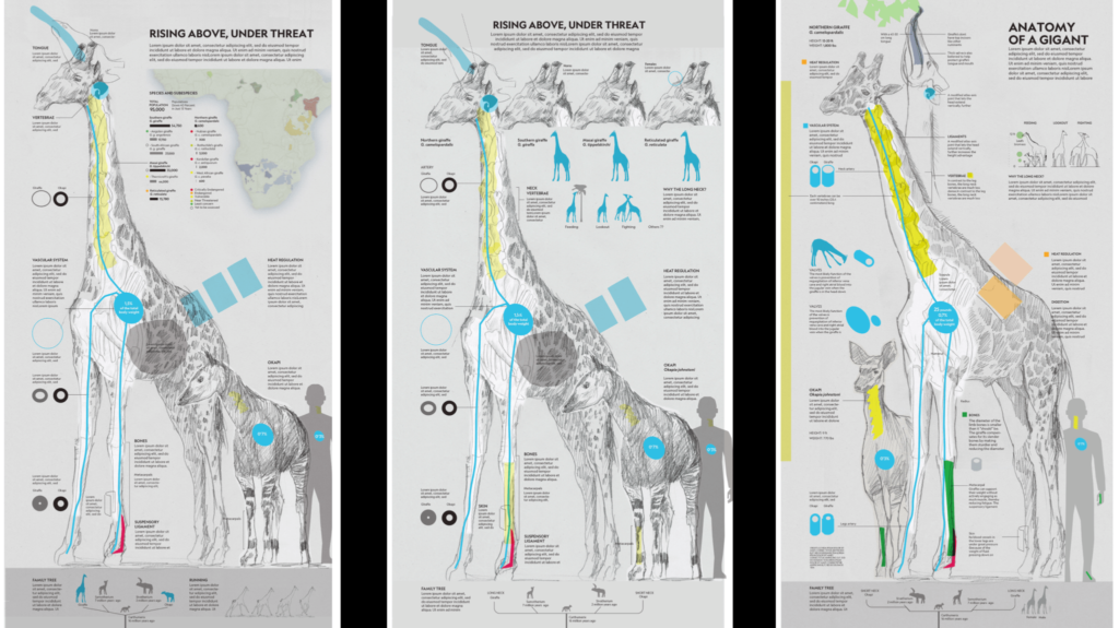
Info-giraffe

Check out this insightful discussion of creative work from Rj Andrews at Info We Trust. It’s an interview with Fernando G. Baptista about his recent (and wonderful) giraffe illustration for National Geographic.

“An early sketch” shared by Baptista’s team with Andrews.

I particularly appreciate how Baptista discusses the team collaboration around this project. For anyone interested in creating beautiful educational content, this is a useful peek into one team’s process.

How We Created Our Immersive Learning Experience

We designed the Mars Mission experience for participants to experience:

  • play (going to Mars!)
  • surprise (audio and video cues, live action drama, actors)
  • awe (cinematic media and light)
  • curiosity (theatrical reveals)
  • flow (a continuous story with problems to solve)

With this video, we hope to share how our team thinks about our creative process in the work of creating educational experiences. We learned a lot about integrating several disciplines into one project. Kim was a great leader for our team!

Post-Rock Star Teams

Valerie Aurora, Mary Gardiner, and Leigh Honeywell have co-authored a great blog post “No more rock stars: how to stop abuse in tech communities”. The article is primarily about supporting women, but it’s also a great read on making more supportive, collaborative, creative teams.

It’s probably worth taking another look at Godin’s Linchpin with ideas from this article, and see how it holds up against the “rock star” metaphor.

Techitecture, The Emergence of

My involvement in Teacher College’s Learning Theater project makes me appreciate how fast-evolving audio/video technologies (or better: display/capture/collaboration technologies) challenge traditional architecture.

Our project feels like “techitecture”—a combination of technology and architectural design and development. (And I’m curious that, having imagined this fanciful term, I have not found it used before in this way.)

The fit and function of technology elements in our space will go beyond traditional theater. Not only will the audience not be “fixed” (in seats, etc.), but it’s not even clear to us what events will eventually unfold in the space.

article-2700073-1FD8588400000578-158_634x462Designing the learning theater space seems more akin to designing the holodeck. It will essentially appear as an empty grid until users imagine ways to activate it.

In undertaking this type of project, it’s clear that architects need to be brave, and AV consultants need to be braver still… We are essentially designing a digital space with bulky materials from the past, and just enough matter to support the needs of humans.

And coffee.

Gymnasiums as “Learning Theaters”?

If you had a high school gymnasium, how would you turn it into a technology-friendly space for teaching, learning, and research?

As part of the Gottesman Libraries team, I’m currently involved in developing the concept of a “learning theater” — both programmatically and architecturally. Pulling this concept out of primordial soup of imagination (if such a space already exists as we imagine it, we do not know of it), our team embarked on a very broad inquiry:

  • What could a learning theater be?
  • What could it be within a library (in our case, it is)?
  • What is it within the context of Teachers College (with its legacy of innovation)?

We’ve already come a long way. Last winter, library staff hosted a series of design events with the TC community (summary videos can be viewed on Vialogues). This fall we’ve been working with a design team from Shepley Bulfinch to develop the concept and arrive at a schematic design. Our goal:

Renovate the 10,000 sq. ft. fourth floor of Russell Hall as a space for ambitious learning and research activities.

One aspect of our design progress that I’m very excited about is the ability for other educational institutions to use what we’re learning (and inevitably going to learn later on, after we move into our facility).

Don’t all schools need innovative teaching and learning spaces? These will be spaces that must accommodate richer and richer densities of learning tools – physical, digital, and any/every combination thereof. Being able to conduct research about teaching and learning in these spaces, therefore, seems to be increasingly important as well.

Retrofitting libraries and high school gymnasiums as new learning spaces could be only the beginning…

Design Thinking & IDEO

For a closer look at design thinking, EdLab is making a series of videos that show individual designers reflecting on its meaning. The first video features Annette Diefenthaler, a Senior Design Research Specialist & Project Lead at IDEO on creating and launching IDEO’s Design Thinking for Educators Toolkit.

Watch the video, and share your perspective on this resource!

A nice boost from Tim Brown:

Advice for a young designer

(click for source)

A friend of mine is wondering how to navigate undergraduate-level design classes (and perhaps ultimately a major or minor). More specifically, he is weighing the difference between “graphic design” and “web design”—and he asked for my thoughts.

Firstly, it matters what kind of work you imagine doing after college… but let’s say that you could do that work and have majored in either field.

Then it matters if you want to take one kind of class more than the others… but let’s say that you don’t have a preference.

Let’s say that what you’re asking is, “What will employer preferences be like when I graduate?” Then, perhaps the subtext here is, “What kind of career should I have?”

OK, so that’s too hard to answer. So let’s go back a step. (In fact, let’s say you don’t know what kind of career you want.)

That makes it a little easier for me to give the following advice: find the college instructors that will make you the very best design thinker.

What is a Design Thinker?

I’m not sure I know. Tim Brown might—he’s a major proponent of the… idea? theory?– I do know that “design thinking” represents an interesting set of related ideas about collaboration, problem-solving, and production. And it seems to apply widely to the way the people and organizations imagine doing good work.

Some characteristics and behaviors that have been useful to me personally (in my own experience and as observed in my collaborators) are:

  • Being a generalist—having a little bit of knowledge about a lot of things (read widely! discuss!)
  • Being a generative thinker—contributing a lot (be brave! drink coffee!)
  • Being empathetic—with both your collaborators and end-users in mind (be observant! be generous!)
  • Being creative—adding a point of view that isn’t already represented (be…um,  creative…)

So: when you go to college—probably any college—find someone (or several people!) who can you help you become better at all of these things.

Then find meaningful internships. Those will give you useful fodder for job interviews.

Oh, and don’t take my advice. I wrote this pretty quickly. Get a second opinion! etc.

(And for an extra hundred bucks, and about a week of effort, you can pick up the specific skills you need to be a good-enough graphic designer or web designer.)

Opening Up Museums

I really enjoy Nina Simon’s blog, and her recent talk is especially exciting: Museum 2.0: Opening Up Museums: My TEDxSantaCruz Talk.

With an upcoming year-long exhibition highlighting the 125-year history of Teachers College, EdLab designers are focused on eliciting “audience” participation in our exhibition environment – three floors of Russell Hall (nearly 30,000 sq. ft.!).

I like how Simon frames the issue of participation around the challenge of making it meaningful – because it’s all too easy to create meaningless activities. But at the same time, she suggests, the hooks for engagement have to be simple enough that people are willing to try something new.

That’s tough to do!

I find that easy and interesting are often at odds. For example, our current goal is to use Twitter as a tool of engagement. But what do you ask people to contribute? 160 characters is already technically simple for folks with a Twitter account, but what kind of content should we elicit?

Photo of a library event by Diana Diroy

For me, solving this issue for a particular content is the essence of an exhibition design process – a process that should result in a unique and engaging solution that serves as a great foundation for learning.

One strategy is to aim to make the results of small contributions cumulative – either in a way that creates one large result, or as a mosaic showcasing individual contributions. Another is to make them personal (perhaps identity-oriented is a similar but useful way to think of this).

Another strategy is to offer an extrinsic reward – to offer a prize, for example. But this seems to be less genuine, or at least less likely to relate to learning. On the other hand, this could be a hook that engages a contributor to do more.

Giant Firefly by AMNH

One recent example of a bad interactive solution that comes to mind is from the recent Creatures of Light exhibition at the American Museum of Natural History (sorry guys). While the exhibit had some nice elements, I was disappointed by the gigantic firefly (six feet long?) that hung from the ceiling and glowed at the press of a button (working from memory here) at the entrance of the show. What did this accomplish?

I assume it was supposed to echo the bioluminescence theme of the exhibit, but for my 3-year-old it really just raised the question, “Are fireflies really that big?” I’m not saying that elements need to work for everyone, but really: aren’t there dozens of more exciting ways to show off the mechanisms of science while creating a stronger foundation for learning? (Wouldn’t a six foot magnifying glass aimed at a life-size firefly been many times more awesome? Aren’t there ways to use lighting to better effect?)

Using a traditional exhibition toolbox (scale, lighting, drama, etc.) alongside newer technologies is a big challenge. I’m excited to see what we can come up with here at Teachers College!

A Service Design Opportunity

I just participated in a two day workshop run by Engine, a UK design group that focuses on applying diverse design processes to designing customer-oriented services. The workshop focused on designing services that are complex by nature, usually involving “four P’s”: People, Places, Processes, and Products (not to be confused with the four P’s of marketing). My goal was to better understand the work we can do to deliver amazing services at the Gottesman Libraries and EdLab.

Joining me were leaders and designers from large and small companies, across many industries. Engine staff presented several very interesting cases (examples from their portfolio) that involved many design methods – methods that are often located within the double diamond design process framework. Learning about their process allowed me to reflect extensively on EdLab’s home-grown CSG process, and how we could modify them for service design (or adopt entirely new practices).

A Library Example

Involving a whole organization in designing (and redesigning) services is becoming increasingly popular in large organizations with ambitious agendas — and service design is quickly being recognized as a distinct design specialty. To share the kind of processes I was exposed to over the past two days, here is a very broad sketch of a possible design scenario library staff could host at Teachers College.

Exploration Phase (Phase 1):

The Opportunity Statement:

To kick off a service design process, an organization must agree on a problem to work on. Short of this, here’s a general opportunity to consider here: What signature service can we add to the library?

Goal Planning:

Let’s try to go from brainstorming to piloting a prototype in three phases over three months.

Elements of Stakeholder Event (Event 1):

  • Get everyone who will be working on the project (including TCstudents, library staff and the Provost or a representative from his office) together to better understand the opportunity and goals.
  • Share an existing case study that relates to a similar institution.
  • Review background materials.
  • Share a “blueprint” of the whole service design process that guides the three-month-long project.

Post event:

  • Invite participants to review background research and share perspectives.
  • Share a short video that captures the activities of the first event (this can be public).
  • Share a written “design brief” that captures the activities of the first event (this can be public).

Insight Phase (Phase 2):

Elements of Stakeholder Event (Event 2):

  • Use “Personas” and service scenarios to develop a shared understanding of opportunities. Be ambitious.
  • Generate ideas for new services and related design solutions (how services will be implemented, delivered, maintained, and refined) to prototype.
  • Use a “service principles” framework to focus on a particular opportunity to focus on.

Post event:

  • Create PX (patron experience) teams to carry out several kinds of design research.
  • Report back to the larger group with outcomes from the research.
  • Share a short video that captures the activities of the first event (this can be public). Capture interviews with participants.
  • Share a written “design brief” that captures the activities of the first event (this can be public).

Prototyping Phase (Phase 3):

Elements of a Stakeholder Event (Event 3):

  • Generate a final set of possible services around the service opportunity (from Stakeholder Event 2), and narrow to a single service.
  • Develop a set of elements of the service from both the patron perspective and the organizational perceptive.
  • Develop a recommended “service blueprint” that responds to the findings from the design research (a condensed list). The blueprint explains the service from both the patron and staff perspectives.

Post event:

  • Make final adjustments to scale and scope of the service.
  • Refine and adapt the service blueprint to serve as a training resource for staff.
  • Share a short video that captures the activities of the first event (this can be public). Capture interviews with participants.
  • Share a written “design brief” that captures the activities of the first event (this can be public).

Implementation:

  • Iterate a version of the service and try it.
  • Collect feedback on the service.
  • Share feedback with the Stakeholders, and explore next steps.

Final Thoughts

Yes, the Services Design process is a humble one. But if it’s done well, it has the potential to improve an organization’s services at multiple points over time. As a process, it’s infused with the ethos of transparency and co-creation – inviting patrons to be part of the library’s process of developing and refining services. Due to the total cost of the process, however, it should not be used to tackle small issues. That is, it’s not meant to overcome the usual challenges of bureaucracy and resource limitations. It’s meant to open up new opportunities that have the potential to expand an organization (as well as positively impact its current culture).

Apologies for cross-posting this example on the EdLab blog.

Why work does happen at work

In his talk “Why work doesn’t happen at work,” Jason Fried criticizes what he calls “M&M’s”: managers and meetings. But is his harsh attitude justified and/or helpful?

For workers in really toxic environments, I’m sure this is refreshing stuff. He says, (and I’m paraphrasing) “Managers just preside over work, so they like to call meetings to see what’s being done… and effectively halt real work.” And this paves the way for his new (repackaged?) ideas:

  • He proposes “no talking Thursday afternoons” as a strategy for allowing a whole organization to “focus on getting work done.”
  • He arrives at some potentially helpful ideas about using “passive” forms of communication (email, instant messaging) rather than active forms (tapping someone on the shoulder).
  • And lastly, he encourages folks to “just cancel meetings.”

The Book Deal

My past colleague Eric Buth has a theory about how people make “book deal” pitches for popular, business-oriented books (and, by extension, the related speaker circuit). He thinks there are three main elements of successful pitches:

  1. The author proposes an “absolutist, contrarian perspective”
  2. This perspective is backed by anecdotal and/or skewed quantitative evidence
  3. And there is a sense of urgency for spreading the author’s solution(s).

So, does Fried’s talk fall into this pattern?

1. Absolutist, contrarian perspective? You bet.

2. Anecdotal and/or skewed quantitative evidence? Yes again (implied, or at least unsupported).

3. A sense of urgency for spreading the author’s solution(s)? Well, you know, either you’re willing to run your business/organization into the ground, or adopt Fried’s ethos. It’s your choice.

A Middle Ground

His message serves as a reminder to generally be productive—a good message. For small businesses, Fried’s message might make a lot of sense. For folks who work in and for larger organizations, maybe less so.

Maybe it’s easier for everyone to collaborate in smaller organizations. (Among other factors, it probably depends on the communication skills of the participants.) But in a larger organization, with several hundred employees or more, how long can individuals and teams go without checking in to a larger group? A week? A month? A good old fashioned meeting might be a refreshing time to reconnect with colleagues and talk through important project details.

I spend time in meetings coordinating people and projects. Every week. Sometimes my colleagues and I don’t make clear progress, but a lot of the time we make decisions that affect the day-to-day work of our colleagues (for better or worse). They are often valuable, and Fried clearly doesn’t disagree. In the end, his solutions are very sensible. The upshot of his claim seems to simply be: not all meetings are good or useful.

Though Fried’s talk serves as a guidepost, I’m interested in more subtle ways to bring unproductive meetings to a halt.