Immersion: When Media is Educational

Sure, video games are immersive, but are they educational? Only to a very small extent. Educators have been pursuing the connections between immersive media like gaming and education for decades, but I want to offer another perspective: learners have to be suspended between being gamers and game-makers. Here’s a brief reflection on how that can happen…

Put Away the Video Games

Games are really only interesting in small doses. So if you’re going to use them for broader educational purpose, keep it short. This same advice applies to many other activities as well: hooks, icebreakers, brainstorms, research, and perhaps even reading. When it comes to ambitious learning goals, how long does it take until we get bored? Are all engaging educational experiences short in duration? (And is this a feature rather than a bug?)

If we contrast active and exciting learning experiences with more conventional lecture-style information delivery, let’s say the best experiences are the short ones. (Even traditional teacher-led experiences collapse after about 50 minutes, though there is evidence that more interaction is perceived as better.) Is formal education—educational experience that spirals and requires significant exposure to achieve significant recall—ever likely to permanently achieve the velocity to escape boredom for most students most of the time? It seems unlikely, but what if the answer was that it could

Dynamic Interventions

Teaching often begins with a presentation or a group activity—activities that help individuals explore new ideas while confronting factual information from experts or authoritative sources. A part of our jobs as “producers” in the Learning Theater is to bridge events (and our event partners) from the present into a better-designed-built-environment future.

In the past two years at EdLab, we have begun experimenting with what I will call “dynamic interventions.” These are generally small multimedia gestures that connect classroom activities:  a soundtrack, a light cue, an introductory video for an activity, or a background image. The Learning Theater has enabled us to manipulate the built environment in both subtle and dramatic ways during a face-to-face learning experiences. Using light, sound, video, props, and furnishings, we have built many multimedia experiences to enhance what began as more ordinary learning scenarios.

Adding multimedia to an educational experience is not always the right thing. (As in all design, sometimes simple is better.) But increasingly we’re seeing the blending of “simple” and “multimedia” moments as creating the optimal conditions for sustaining learning over the course of an hour, an afternoon, a day, or longer.

Recent events have given us more confidence to steer our partners toward building dynamic interventions into their plans, and I’m excited to see where these efforts lead. But it won’t just be a matter of adding “fun” and “exciting” multimedia moments into lectures that optimizes learning. The learners are going to be active participants in the process of design and execution.

Immersion

I think “immersion” is a helpful word to describe this enhanced educational experience. Often used in language learning to describe a situation where learner can’t help but be confronted with educationally rich experience, it also comes to us with a sense that the learner is sustained in a state of flow. How can that happen?

Only learners can ultimately tell us what they need. Do they need a break? Do they need a boost of energy? Do they need time to reflect and write? Or time to talk together? Involving learners in the ebb and flow of educational experience with dynamic interventions will raise the stakes. Educators can offer learners an environment, but learners will need to activate it.

Collaboration is a key element of dynamic interventions we’ve made so far. (Learning is often more fun together!) With respect to collaborative activities, learners are really asked to be both participants and educators—taking an active role in their colleagues’ learning. Dynamic interventions can help support learners in both their roles by giving their work new contexts as an activity unfolds—and in a highly aesthetic way. Ultimately, I imagine that the suspension of learners between these different orientations can best sustain a flow experience. Time will tell…

Alas, we are just beginning to explore the possibilities of this exciting—and I think somewhat novel, or at least technologically-heightened—nexus of knowledge, creativity, and learning.

What are ways do you think we can further (or best) support the development and sharing of these ideas and our toolset?

What’s the future of Twitter?

image

Twitter stock has recently suffered as a result of weak earnings (and related confidence), so I’ve been reflecting on the value I place in it versus Facebook.

Everyone’s surely different, but I figure one way for me to assess it is to evaluate the differences between the list of my Facebook friends and the accounts I follow on Twitter (I have to add my handle to my own list’s URL on Twitter, but of course with my “default” settings I can’t even share my Facebook list).

So what do I see? In my case, a rather subtle difference! Even before this comparison, I recognize that in my case I use these services in very similar ways—some close friends, some strangers—in short, a mixed social bag on both accounts. But by looking closely, the “game-ish” contours of Twitter start to emerge…

  • where word-smithing is more important… and fun (it’s such a chore on Facebook)
  • where I feel like I’m actively doling out social recognition by re-tweeting and favoriting (as opposed to the more personal Facebook “like”)
  • where I can easily search for new ideas (and break out of my filter bubble)
  • where I can blend my personal and professional interests (there just isn’t room for my professional self on Facebook
  • where my new ideas seems to matter more than my same old self

The indicators above seem like distinctly intellectual features that such a service could offer. In all other ways, Facebook and Twitter seem almost identical to me.

I recognize that this is a very particular case, and that there are many other ways to use these services. But, head-to-head, pound-for-pound, I also suspect that there is a deeper indication here that Twitter, even (or perhaps especially) when viewed as a redundant service, is of equal social value to Facebook in the emerging world.

Perhaps, even greater.


image credit: http://attending.io/events/free-lunchtime-intro-workshop-twitter-facebook-ads

Learning with Apple Live

Apple’s live events keep evolving, and I would love to be able to use their “live broadcasting” toolkit—essentially turning their website into a media-rich live blog of the event. Here’s a screenshot of what today’s Apple Watch-focused event looked like:

Screen Shot 2015-03-09 at 2.17.49 PM


The key features of this mode of presentation are:

  • Live video of the main presentation—which is being produced somewhere (usually California) for a live audience.
  • Produced video elements are used during the presentation. Split-screens are sometimes used to juxtapose the speaker and other content (as above).
  • Pre-made, widget-like cards appear from top to bottom with short summaries (including images and video) of the presentation content. They have simple, built-in social sharing functionality.
  • When you scroll down to see older cards, the video is shrunk to a thumbnail and continues to play at the top of the page.

These elements combine for a simple, compelling online presentation. One can easily step away and come back, and skim the cards to see what was missed. It would be equally great if the presentation could be replayed from the point of any ‘card’… though I don’t think this is currently the case!

So, if I had this presentation toolkit, would I use it? Given the amount of pre-planning and multimedia in use, it would certainly take a significant up-front investment (e.g., time, money, preparation). However, to deliver a high-impact event to a web audience, it seems like a great place to start.

I especially like the live element—which underscores the event with the sense that, “this would be even more impressive in person, but I’m as close as I can get!”

Techitecture, The Emergence of

My involvement in Teacher College’s Learning Theater project makes me appreciate how fast-evolving audio/video technologies (or better: display/capture/collaboration technologies) challenge traditional architecture.

Our project feels like “techitecture”—a combination of technology and architectural design and development. (And I’m curious that, having imagined this fanciful term, I have not found it used before in this way.)

The fit and function of technology elements in our space will go beyond traditional theater. Not only will the audience not be “fixed” (in seats, etc.), but it’s not even clear to us what events will eventually unfold in the space.

article-2700073-1FD8588400000578-158_634x462Designing the learning theater space seems more akin to designing the holodeck. It will essentially appear as an empty grid until users imagine ways to activate it.

In undertaking this type of project, it’s clear that architects need to be brave, and AV consultants need to be braver still… We are essentially designing a digital space with bulky materials from the past, and just enough matter to support the needs of humans.

And coffee.

Gymnasiums as “Learning Theaters”?

If you had a high school gymnasium, how would you turn it into a technology-friendly space for teaching, learning, and research?

As part of the Gottesman Libraries team, I’m currently involved in developing the concept of a “learning theater” — both programmatically and architecturally. Pulling this concept out of primordial soup of imagination (if such a space already exists as we imagine it, we do not know of it), our team embarked on a very broad inquiry:

  • What could a learning theater be?
  • What could it be within a library (in our case, it is)?
  • What is it within the context of Teachers College (with its legacy of innovation)?

We’ve already come a long way. Last winter, library staff hosted a series of design events with the TC community (summary videos can be viewed on Vialogues). This fall we’ve been working with a design team from Shepley Bulfinch to develop the concept and arrive at a schematic design. Our goal:

Renovate the 10,000 sq. ft. fourth floor of Russell Hall as a space for ambitious learning and research activities.

One aspect of our design progress that I’m very excited about is the ability for other educational institutions to use what we’re learning (and inevitably going to learn later on, after we move into our facility).

Don’t all schools need innovative teaching and learning spaces? These will be spaces that must accommodate richer and richer densities of learning tools – physical, digital, and any/every combination thereof. Being able to conduct research about teaching and learning in these spaces, therefore, seems to be increasingly important as well.

Retrofitting libraries and high school gymnasiums as new learning spaces could be only the beginning…

Design Thinking & IDEO

For a closer look at design thinking, EdLab is making a series of videos that show individual designers reflecting on its meaning. The first video features Annette Diefenthaler, a Senior Design Research Specialist & Project Lead at IDEO on creating and launching IDEO’s Design Thinking for Educators Toolkit.

Watch the video, and share your perspective on this resource!

A nice boost from Tim Brown:

Advice for a young designer

(click for source)

A friend of mine is wondering how to navigate undergraduate-level design classes (and perhaps ultimately a major or minor). More specifically, he is weighing the difference between “graphic design” and “web design”—and he asked for my thoughts.

Firstly, it matters what kind of work you imagine doing after college… but let’s say that you could do that work and have majored in either field.

Then it matters if you want to take one kind of class more than the others… but let’s say that you don’t have a preference.

Let’s say that what you’re asking is, “What will employer preferences be like when I graduate?” Then, perhaps the subtext here is, “What kind of career should I have?”

OK, so that’s too hard to answer. So let’s go back a step. (In fact, let’s say you don’t know what kind of career you want.)

That makes it a little easier for me to give the following advice: find the college instructors that will make you the very best design thinker.

What is a Design Thinker?

I’m not sure I know. Tim Brown might—he’s a major proponent of the… idea? theory?– I do know that “design thinking” represents an interesting set of related ideas about collaboration, problem-solving, and production. And it seems to apply widely to the way the people and organizations imagine doing good work.

Some characteristics and behaviors that have been useful to me personally (in my own experience and as observed in my collaborators) are:

  • Being a generalist—having a little bit of knowledge about a lot of things (read widely! discuss!)
  • Being a generative thinker—contributing a lot (be brave! drink coffee!)
  • Being empathetic—with both your collaborators and end-users in mind (be observant! be generous!)
  • Being creative—adding a point of view that isn’t already represented (be…um,  creative…)

So: when you go to college—probably any college—find someone (or several people!) who can you help you become better at all of these things.

Then find meaningful internships. Those will give you useful fodder for job interviews.

Oh, and don’t take my advice. I wrote this pretty quickly. Get a second opinion! etc.

(And for an extra hundred bucks, and about a week of effort, you can pick up the specific skills you need to be a good-enough graphic designer or web designer.)

Opening Up Museums

I really enjoy Nina Simon’s blog, and her recent talk is especially exciting: Museum 2.0: Opening Up Museums: My TEDxSantaCruz Talk.

With an upcoming year-long exhibition highlighting the 125-year history of Teachers College, EdLab designers are focused on eliciting “audience” participation in our exhibition environment – three floors of Russell Hall (nearly 30,000 sq. ft.!).

I like how Simon frames the issue of participation around the challenge of making it meaningful – because it’s all too easy to create meaningless activities. But at the same time, she suggests, the hooks for engagement have to be simple enough that people are willing to try something new.

That’s tough to do!

I find that easy and interesting are often at odds. For example, our current goal is to use Twitter as a tool of engagement. But what do you ask people to contribute? 160 characters is already technically simple for folks with a Twitter account, but what kind of content should we elicit?

Photo of a library event by Diana Diroy

For me, solving this issue for a particular content is the essence of an exhibition design process – a process that should result in a unique and engaging solution that serves as a great foundation for learning.

One strategy is to aim to make the results of small contributions cumulative – either in a way that creates one large result, or as a mosaic showcasing individual contributions. Another is to make them personal (perhaps identity-oriented is a similar but useful way to think of this).

Another strategy is to offer an extrinsic reward – to offer a prize, for example. But this seems to be less genuine, or at least less likely to relate to learning. On the other hand, this could be a hook that engages a contributor to do more.

Giant Firefly by AMNH

One recent example of a bad interactive solution that comes to mind is from the recent Creatures of Light exhibition at the American Museum of Natural History (sorry guys). While the exhibit had some nice elements, I was disappointed by the gigantic firefly (six feet long?) that hung from the ceiling and glowed at the press of a button (working from memory here) at the entrance of the show. What did this accomplish?

I assume it was supposed to echo the bioluminescence theme of the exhibit, but for my 3-year-old it really just raised the question, “Are fireflies really that big?” I’m not saying that elements need to work for everyone, but really: aren’t there dozens of more exciting ways to show off the mechanisms of science while creating a stronger foundation for learning? (Wouldn’t a six foot magnifying glass aimed at a life-size firefly been many times more awesome? Aren’t there ways to use lighting to better effect?)

Using a traditional exhibition toolbox (scale, lighting, drama, etc.) alongside newer technologies is a big challenge. I’m excited to see what we can come up with here at Teachers College!

Designing Learning Futures

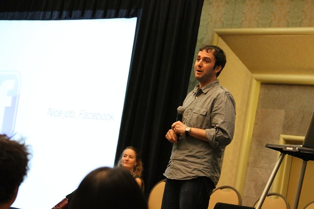
Here I am giving an Ignite-style talk two weeks ago at The Digital Media and Learning Conference in Long Beach, CA. It was my first time (both giving this style talk and attending the DML conference), and I really liked the format—20 slides auto-advancing every 15 seconds for 5 minutes. They’re supposed to be fun and thought-provoking, which was a good challenge in the context of a conference about “designing learning futures.” I tried gently poking fun at the audience by suggesting that we’ve all dreamed about being the person who, once and for all, creates a “Facebook-for-learning.”

The main point of the presentation was to think through how we’d go about building it—with a focus on development choices. Based on a simple rubric of what characteristics such a learning-centered application would have, I asked the audience to consider four diverse models of “social” apps (Facebook, Amazon, Moodle, and the SATs). I suggested the image of an Okapi neatly summarized the development conundrum, and concluded that such an application should be complementary to Facebook—not its replacement.

Well, there’s no guarentee my talk was substantial enough for the audience, but I enjoyed putting it together and delivering it. Several of the other speakers shared heartfelt, personal stories, and I couldn’t help feeling a bit upstaged. Deservedly so!

But the subtext of my talk—which I hope I sparked in at least a few of the couple hundred people in attendance—was to consider the necessity of developing niche applications for educational contexts. That is, it’s glorious that Facebook has a community of 600MM+ users, but it’s unlikely that learning communities will benefit much from being part of such a large-scale project. Sure, it would be great to preside over such a massive community as a software designer, and there are many feats that could be accomplished with data that it would throw off, but I’m skeptical it could serve learners more powerfully than smaller, more focused tools.

So, though I asked people to think about development issues, I hoped they walked away thinking about a learner’s “user experience.” I am cautiously optimistic that at least one person did so, as she tweeted:

“Facebook for learning. Okapi problem.”